Our latest version of Leapfrog looks a lot different, but what you see is only the front cover of a massive redevelopment story that has truly been a collaborative team effort and one we wanted to share with you. The result is a brand new Leapfrog for you to love whilst laying strong foundations for you to tackle more emerging and complex geological modelling challenges in years to come.
Leapfrog has been completely rebuilt on a powerful new code base, giving you up to 25% faster processing and faster drillhole loading. Making your lives easier and allowing you to focus on the geology is what matters to us, that is why we have made a marathon effort behind the scenes to save you time today and set you up for the future. To give you an idea of the time investment, the total project in person years has accumulated a staggering 34 years. This is the single biggest project Seequent has ever tackled, seven teams and a total of 47 developers and testers worked concurrently over nine months. Our ambition? To deliver a robust and future-focused Leapfrog, ensuring it behaved in much the same way and continued to delight users.
Seequent’s Vice President, Engineering, John Good says, “We basically wanted to replicate as much as possible, ensuring our users’ lives weren’t disrupted too greatly but more importantly, we wanted to do it better.”
Running the ‘marathon’ required significant attention to detail and more running analogies! As John Good explains, “To be the most agile, we tackled it in sprints. First everyone was on MVVM, (software design architecture) and then everyone on Qt (the new user interface) and finally Python 3 (high level programming language) was run in parallel with Qt.” Everything was sized using a consistent methodology, with careful project management and monitoring, with progress tracked using burndown and burnup charts to make sure each of the seven teams’ time was optimised. Adds John, “The whole team should be justifiably proud of the effort and their achievement.”
Scale of the effort
What we have now
The end result delivers some considerable processing speed advances, new efficiency boosting workflows and increased interoperability. Making these changes has also meant that many of the ‘stones in your shoes’, those little annoyances you have experienced in the past, have gone. For example, you can rename columns and delete them on drillhole interval tables. But without a doubt what you’ll notice first of all is that Leapfrog looks different. It has a completely refreshed user interface (UI), replacing what was an old look and bringing it bang up to date, with a modern, elegant and functional design. Rest assured that everything you know and love remains but now it’s a whole lot better!
For instance, icons may look different but they’re in the same place and the order and types of tasks remain the same. There is also consistency in the location of objects, for instance the project tree remains on the left and the scene list defaults are on the bottom. Adds Gia, “Some changes to how you do things were necessary, but we kept those to a minimum and consistent with the users’ current experiences
Seequent’s UX/UI Architect Gia Romano Comments, “We have been carefully crafting these updates to provide a modern experience that’s simpler and aligns all of our solutions with a consistent look and feel. Because the visual improvements are quite different, it is important that we introduced the UI changes first and roll out improvements to structure and flow to keep our customers engaged and productive in their day-to-day tasks.”
This new UI has enabled us to bring our desktop apps in line with the web and cloud and make sure iconography (the imagery used to represent an application, capability or concept) is current and consistent in design.
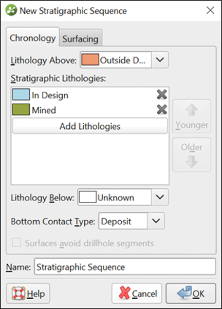
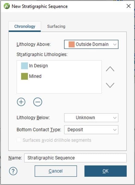
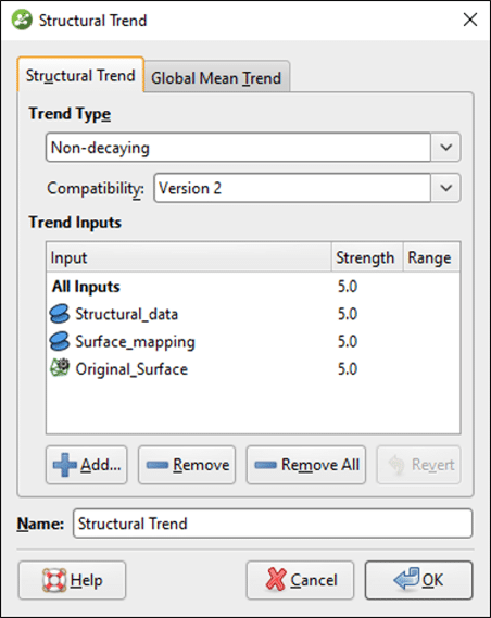
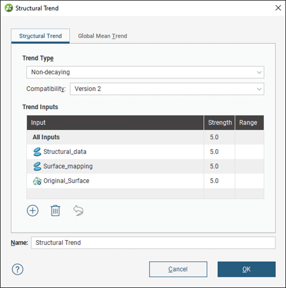
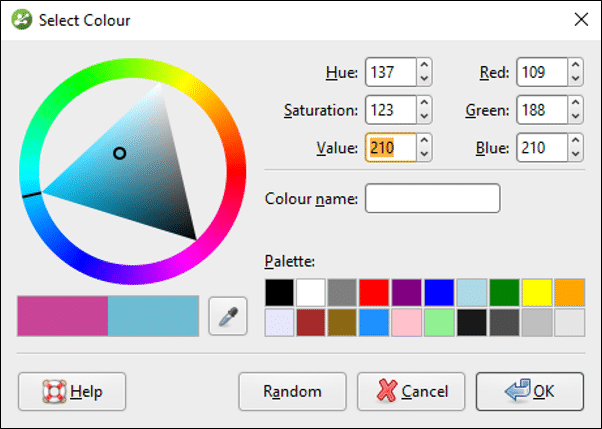
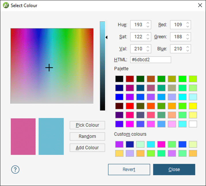
A mammoth research process helped to establish the direction and with it agreement on theme colours and the Seequent design system, making sure icons aligned and looked like one happy family.
“It isn’t an exact science, some things you just can’t do across the board so we had to make adjustments to adhere to the requirements of a desktop application. We spent months looking at concepts to ensure consistency in such things as UI Design and Patterns, so that there’s a consistency to each application, project tree and shape list. We reviewed all buttons so that they are in the same place and ranked in importance and icons. Tweaking one rule effectively has a knock-on effect to 764 others.” Comments Gia.
Product Owner, Rachel Murtagh explains, “One of the design rules was that we would retain only a primary and secondary button with the help icon on the bottom left of the dialogue.”
Whittling down all of this effort into one key benefit is that users can easily move across packages and quickly become effective, so whether you’re in Leapfrog, Seequent Central, or in the new web visualisation tool, it’s all going to feel the same.
“Overall there’s more consistency with established patterns of how to do things, the essence is there, it will feel similar,” comments Rachel, “but the look is streamlined and is more consistent as people move from dialogue to dialogue and from product to product.”
You’ll also experience some other benefits, screen sharing works properly and support for hi-res monitors is better, memory is reduced and we’ve put the groundwork in place for more exciting developments to come, which we’ll reveal down the track.
Product Manager Geological Modelling, Byron Taylor, comments, “The end result is that we now have a much more streamlined portfolio with a much more cohesive feel, this means our users can confidently move from one solution to the other. From a technical view point, the future of Leapfrog has been secured for many years to come.”
Have you explored the new leapfrog? Go to our what’s new page and get access to MySeequent where you can download the new version and view lots of materials to help you.


